Learn how to evaluate and validate the quality of learned embeddings before deploying to production.
Introduction: The Quality Gap
After training your TabularResNet using self-supervised learning (Part 4), you need to verify that the embeddings are actually useful before deploying to production.
The Problem
Just because your training loss decreased doesn’t mean your embeddings are good. A model can memorize training data while learning useless representations that fail on real anomaly detection.
The Goal
Good embeddings must be:
Meaningful: Similar OCSF records (e.g., login events from same user) have similar embeddings
Discriminative: Different event types (e.g., successful login vs failed login) are separated in embedding space
Robust: Small noise in input features (±5% in bytes, slight time jitter) doesn’t drastically change embeddings
Useful: Enable effective anomaly detection downstream (Part 6)
The Approach
We evaluate embeddings using a two-pronged strategy that follows the data science workflow:
| Phase | Focus | Methods |
|---|---|---|
| Phase 1: Qualitative | Visual inspection | t-SNE, UMAP, Nearest Neighbors |
| Phase 2: Quantitative | Structural measurement | Silhouette, Davies-Bouldin, Calinski-Harabasz |
| Phase 3: Robustness | Stress testing | Perturbation stability, k-NN classification, Model comparison |
| Phase 4: Operational | Production readiness | Latency, Memory, Cost trade-offs |
Why this matters for observability data: Poor embeddings make anomaly detection fail silently. If your model thinks failed requests look similar to successful ones, it won’t catch service degradation or configuration errors. Evaluation catches these problems early.
Phase 1: Qualitative Inspection (The “Eye Test”)
Before calculating metrics, visualize the high-dimensional space to catch obvious semantic failures. Numbers don’t tell the whole story—a model might have a high Silhouette Score but still confuse critical event types (e.g., treating errors the same as successful operations).
The goal: Project high-dimensional embeddings (e.g., 256-dim) → 2D scatter plot for visual inspection.
Dimensionality Reduction: t-SNE vs. UMAP
Two techniques help us visualize high-dimensional embedding spaces in 2D:
t-SNE: Focus on Local Structure
What is t-SNE? t-Distributed Stochastic Neighbor Embedding reduces high-dimensional embeddings to 2D while preserving local structure. Similar points in 256-dim space stay close in 2D, different points stay far apart.
When to use t-SNE:
Exploring your embedding space for the first time
Identifying distinct clusters (e.g., login events, file access, network connections)
Finding outliers and anomalies visually
Limitations:
Can distort global distances (two clusters that appear close in 2D might be far apart in 256-dim)
Sensitive to hyperparameters (perplexity changes the plot dramatically)
Doesn’t preserve exact distances (only neighborhood relationships)
Key parameter—Perplexity: Balances attention between local and global aspects (think of it as “expected number of neighbors”):
perplexity=5: Focuses on very local structure (good for finding small clusters)
perplexity=30: Balanced view (default, good starting point)
perplexity=50: Emphasizes global structure (good for large datasets >10K samples)
Visual intuition for perplexity:
Source
# Required imports for this visualization
import numpy as np
import matplotlib.pyplot as plt
from sklearn.manifold import TSNE
from matplotlib.patches import Ellipse

# Visualize how perplexity affects t-SNE's local vs global structure preservation
fig, axes = plt.subplots(1, 3, figsize=(15, 4.5))

np.random.seed(42)

# Original high-dimensional structure: A close to B, both far from C
# Create synthetic data that mimics this
n_per_cluster = 30
cluster_A = np.random.randn(n_per_cluster, 50) * 0.5 + np.array([0, 0] + [0]*48)
cluster_B = np.random.randn(n_per_cluster, 50) * 0.5 + np.array([2, 0] + [0]*48)  # Close to A
cluster_C = np.random.randn(n_per_cluster, 50) * 0.5 + np.array([10, 0] + [0]*48)  # Far from A and B

data = np.vstack([cluster_A, cluster_B, cluster_C])
cluster_labels = np.array(['A']*n_per_cluster + ['B']*n_per_cluster + ['C']*n_per_cluster)
colors = {'A': '#3498db', 'B': '#e74c3c', 'C': '#2ecc71'}

# Panel 1: Original high-dimensional structure (conceptual 1D projection)
ax = axes[0]
ax.set_xlim(-2, 16)
ax.set_ylim(-2, 2)

# Draw clusters as ellipses with labels
for cx, label, color in [(0, 'A', '#3498db'), (2, 'B', '#e74c3c'), (10, 'C', '#2ecc71')]:
    ellipse = Ellipse((cx, 0), 1.5, 1.2, facecolor=color, alpha=0.3, edgecolor=color, linewidth=2)
    ax.add_patch(ellipse)
    # Add points inside
    pts_x = np.random.randn(8) * 0.3 + cx
    pts_y = np.random.randn(8) * 0.25
    ax.scatter(pts_x, pts_y, c=color, s=40, alpha=0.8, edgecolors='white', linewidth=0.5)
    ax.text(cx, -1.4, label, ha='center', fontsize=14, fontweight='bold', color=color)

# Draw distance annotations
ax.annotate('', xy=(1.8, 0.9), xytext=(0.2, 0.9),
            arrowprops=dict(arrowstyle='<->', color='#555', lw=1.5))
ax.text(1, 1.15, 'close', ha='center', fontsize=10, color='#555')

ax.annotate('', xy=(9.5, -0.9), xytext=(2.5, -0.9),
            arrowprops=dict(arrowstyle='<->', color='#555', lw=1.5))
ax.text(6, -0.65, 'far', ha='center', fontsize=10, color='#555')

ax.set_title('Original High-Dimensional Space', fontsize=12, fontweight='bold', pad=10)
ax.set_xticks([])
ax.set_yticks([])
ax.spines['top'].set_visible(False)
ax.spines['right'].set_visible(False)
ax.spines['bottom'].set_visible(False)
ax.spines['left'].set_visible(False)

# Panel 2: Low perplexity t-SNE
ax = axes[1]
tsne_low = TSNE(n_components=2, perplexity=5, random_state=42, max_iter=1000)
emb_low = tsne_low.fit_transform(data)

for label in ['A', 'B', 'C']:
    mask = cluster_labels == label
    ax.scatter(emb_low[mask, 0], emb_low[mask, 1], c=colors[label], s=50,
               alpha=0.8, edgecolors='white', linewidth=0.5, label=f'Cluster {label}')

ax.set_title('Low Perplexity (5)\n"Who are my immediate neighbors?"', fontsize=12, fontweight='bold')
ax.set_xlabel('t-SNE dim 1', fontsize=10)
ax.set_ylabel('t-SNE dim 2', fontsize=10)
ax.legend(loc='best', fontsize=9)
ax.grid(True, alpha=0.3)

# Panel 3: High perplexity t-SNE
ax = axes[2]
tsne_high = TSNE(n_components=2, perplexity=50, random_state=42, max_iter=1000)
emb_high = tsne_high.fit_transform(data)

for label in ['A', 'B', 'C']:
    mask = cluster_labels == label
    ax.scatter(emb_high[mask, 0], emb_high[mask, 1], c=colors[label], s=50,
               alpha=0.8, edgecolors='white', linewidth=0.5, label=f'Cluster {label}')

ax.set_title('High Perplexity (50)\n"How does my cluster relate to all others?"', fontsize=12, fontweight='bold')
ax.set_xlabel('t-SNE dim 1', fontsize=10)
ax.set_ylabel('t-SNE dim 2', fontsize=10)
ax.legend(loc='best', fontsize=9)
ax.grid(True, alpha=0.3)

plt.tight_layout()
plt.show()

print("="*70)
print("READING THIS VISUALIZATION")
print("="*70)
print()
print("LEFT PANEL (Original Space):")
print("  • Shows the TRUE relationships: A is close to B, both are far from C")
print("  • This is what we want t-SNE to preserve")
print()
print("MIDDLE PANEL (Low Perplexity = 5):")
print("  • Each point only 'looks at' ~5 neighbors")
print("  • Result: Tight, well-separated clusters (good for local structure)")
print("  • Problem: Global distances are distorted—C may not look 'far' from A/B")
print()
print("RIGHT PANEL (High Perplexity = 50):")
print("  • Each point 'looks at' ~50 neighbors (more global view)")
print("  • Result: Better preservation of cluster relationships")
print("  • C should appear farther from A/B, matching the original space")
print()
print("KEY TAKEAWAY: Start with perplexity=30, adjust based on what you need:")
print("  • Lower (5-15): Finding tight local clusters")
print("  • Higher (50+): Understanding global structure")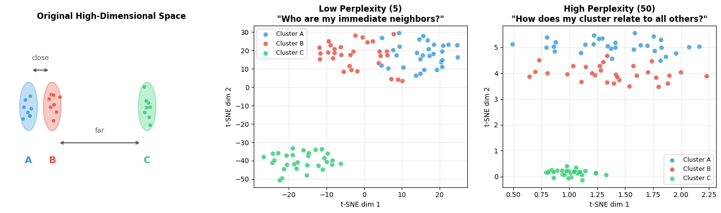
======================================================================
READING THIS VISUALIZATION
======================================================================

LEFT PANEL (Original Space):
  • Shows the TRUE relationships: A is close to B, both are far from C
  • This is what we want t-SNE to preserve

MIDDLE PANEL (Low Perplexity = 5):
  • Each point only 'looks at' ~5 neighbors
  • Result: Tight, well-separated clusters (good for local structure)
  • Problem: Global distances are distorted—C may not look 'far' from A/B

RIGHT PANEL (High Perplexity = 50):
  • Each point 'looks at' ~50 neighbors (more global view)
  • Result: Better preservation of cluster relationships
  • C should appear farther from A/B, matching the original space

KEY TAKEAWAY: Start with perplexity=30, adjust based on what you need:
  • Lower (5-15): Finding tight local clusters
  • Higher (50+): Understanding global structure
Rule of thumb: perplexity should be smaller than your number of samples. For 1000 samples, try perplexity 5-50.
Example implementation: The following code shows how to create a t-SNE visualization function and apply it to simulated OCSF embeddings with different event types and anomalies.
Source
import logging
import warnings

logging.getLogger("matplotlib.font_manager").setLevel(logging.ERROR)

import numpy as np
import matplotlib.pyplot as plt
from sklearn.manifold import TSNE
import torch

def visualize_embeddings_tsne(embeddings, labels=None, title="Embedding Space (t-SNE)", perplexity=30):
    """
    Visualize embeddings using t-SNE.

    Args:
        embeddings: (num_samples, embedding_dim) numpy array
        labels: Optional labels for coloring points
        title: Plot title
        perplexity: t-SNE perplexity parameter (5-50 typical)

    Returns:
        matplotlib figure
    """
    # Run t-SNE
    tsne = TSNE(n_components=2, perplexity=perplexity, random_state=42, max_iter=1000)
    embeddings_2d = tsne.fit_transform(embeddings)

    # Plot
    fig, ax = plt.subplots(figsize=(10, 8))

    if labels is not None:
        unique_labels = np.unique(labels)
        colors = plt.cm.tab10(np.linspace(0, 1, len(unique_labels)))

        for i, label in enumerate(unique_labels):
            mask = labels == label
            ax.scatter(embeddings_2d[mask, 0], embeddings_2d[mask, 1],
                      c=[colors[i]], label=f"Class {label}", alpha=0.6, s=30)

        ax.legend(loc='best')
    else:
        ax.scatter(embeddings_2d[:, 0], embeddings_2d[:, 1], alpha=0.6, s=30)

    ax.set_title(title, fontsize=14, fontweight='bold')
    ax.set_xlabel('t-SNE Dimension 1', fontsize=12)
    ax.set_ylabel('t-SNE Dimension 2', fontsize=12)
    ax.grid(True, alpha=0.3)

    plt.tight_layout()
    return fig

# Example: Simulate embeddings for normal and anomalous data
np.random.seed(42)

# Normal data: 3 clusters
normal_cluster1 = np.random.randn(200, 256) * 0.5 + np.array([0, 0] + [0]*254)
normal_cluster2 = np.random.randn(200, 256) * 0.5 + np.array([3, 3] + [0]*254)
normal_cluster3 = np.random.randn(200, 256) * 0.5 + np.array([-3, 3] + [0]*254)

# Anomalies: scattered outliers
anomalies = np.random.randn(60, 256) * 2.0 + np.array([5, -5] + [0]*254)

all_embeddings = np.vstack([normal_cluster1, normal_cluster2, normal_cluster3, anomalies])
labels = np.array([0]*200 + [1]*200 + [2]*200 + [3]*60)

fig = visualize_embeddings_tsne(all_embeddings, labels, title="OCSF Embeddings (t-SNE)")
plt.show()

print("✓ t-SNE visualization complete")
print("  - Look for clear cluster separation")
print("  - Anomalies should be outliers or in sparse regions")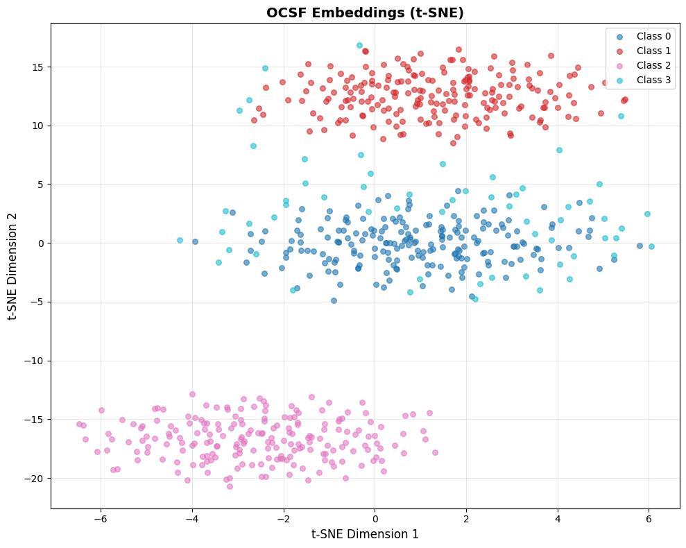
✓ t-SNE visualization complete
  - Look for clear cluster separation
  - Anomalies should be outliers or in sparse regions
Interpreting this visualization: This example uses simulated data with a fixed random seed, so you’ll always see the same pattern:
Classes 0, 1, 2 (blue, red, pink): Three distinct clusters representing different “normal” event types. In real OCSF data, these might be successful logins, file access events, and network connections.
Class 3 (cyan): Scattered points representing anomalies. Notice they’re more dispersed and positioned away from the tight normal clusters.
What this demonstrates:
Good embeddings produce tight, well-separated clusters for normal behavior
Anomalies appear as outliers or in sparse regions between clusters
The clear separation here is idealized—real embeddings will have more overlap
When analyzing your own embeddings, ask:
Do you see distinct clusters? (If not, embeddings may not have learned meaningful structure)
Are the clusters interpretable? (Can you map them to event types?)
Where are your known anomalies? (They should be outliers, not mixed into normal clusters)
Using Embedding Norm as Anomaly Indicator
Beyond clustering structure, the magnitude (L2 norm) of embeddings can reveal anomalies.
Models often produce embeddings with unusual norms for inputs that differ from training data.
Source
# Dual visualization: structure + embedding norm
fig, axes = plt.subplots(1, 2, figsize=(16, 6))

# Run t-SNE once
tsne = TSNE(n_components=2, perplexity=30, random_state=42, max_iter=1000)
emb_2d = tsne.fit_transform(all_embeddings)

# Left: Colored by class labels (known structure)
colors = plt.cm.tab10(np.linspace(0, 1, len(np.unique(labels))))
for i, label in enumerate(np.unique(labels)):
    mask = labels == label
    axes[0].scatter(emb_2d[mask, 0], emb_2d[mask, 1],
                   c=[colors[i]], label=f"Class {label}", alpha=0.6, s=30)
axes[0].legend(loc='best')
axes[0].set_title('Colored by Class (Known Labels)', fontsize=14, fontweight='bold')
axes[0].set_xlabel('t-SNE Dimension 1', fontsize=12)
axes[0].set_ylabel('t-SNE Dimension 2', fontsize=12)
axes[0].grid(True, alpha=0.3)

# Right: Colored by embedding norm (anomaly indicator)
norms = np.linalg.norm(all_embeddings, axis=1)
scatter = axes[1].scatter(emb_2d[:, 0], emb_2d[:, 1], c=norms,
                          cmap='viridis', alpha=0.6, s=30, edgecolors='none')
axes[1].set_title('Colored by Embedding Norm (Anomaly Indicator)', fontsize=14, fontweight='bold')
axes[1].set_xlabel('t-SNE Dimension 1', fontsize=12)
axes[1].set_ylabel('t-SNE Dimension 2', fontsize=12)
axes[1].grid(True, alpha=0.3)
cbar = plt.colorbar(scatter, ax=axes[1])
cbar.set_label('L2 Norm', fontsize=11)

plt.tight_layout()
plt.show()

print("\n" + "="*60)
print("COMPARING THE TWO VIEWS")
print("="*60)
print("LEFT (Class Labels):")
print("  - Shows cluster structure and class separation")
print("  - Useful when you have labeled data")
print("")
print("RIGHT (Embedding Norm):")
print("  - Yellow/bright = high norm = potentially unusual")
print("  - Purple/dark = low norm = typical patterns")
print("  - Anomalies often have different norms than normal data")
print("")
print("WHAT TO LOOK FOR:")
print("  ✓ Anomaly cluster (Class 3) should show different norm range")
print("  ✓ High-norm outliers in sparse regions = strong anomaly signal")
print("  ✗ If norms are uniform everywhere, norm isn't a useful indicator")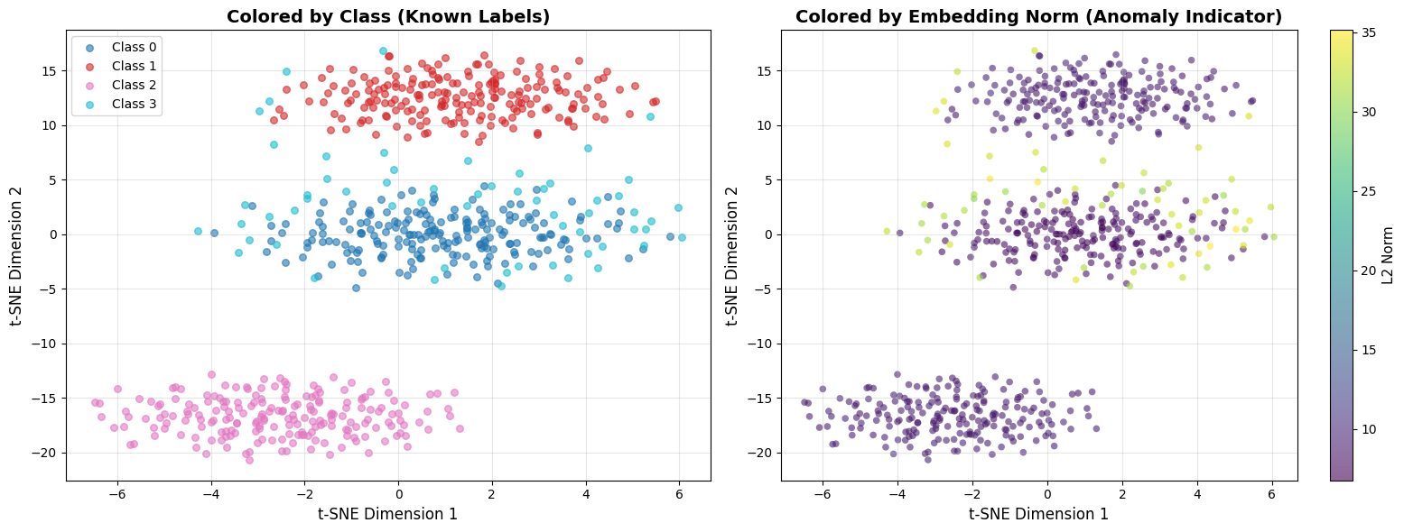
============================================================
COMPARING THE TWO VIEWS
============================================================
LEFT (Class Labels):
  - Shows cluster structure and class separation
  - Useful when you have labeled data

RIGHT (Embedding Norm):
  - Yellow/bright = high norm = potentially unusual
  - Purple/dark = low norm = typical patterns
  - Anomalies often have different norms than normal data

WHAT TO LOOK FOR:
  ✓ Anomaly cluster (Class 3) should show different norm range
  ✓ High-norm outliers in sparse regions = strong anomaly signal
  ✗ If norms are uniform everywhere, norm isn't a useful indicator
Why embedding norm matters: Neural networks often produce embeddings with unusual magnitudes for out-of-distribution inputs. A login event from a never-seen IP might have a much higher or lower norm than typical logins. This is a free anomaly signal you get alongside distance-based detection.
UMAP: Focus on Global Structure
What is UMAP? Uniform Manifold Approximation and Projection preserves both local and global structure better than t-SNE. Generally faster and more scalable.
When to use UMAP instead of t-SNE:
You have >10K samples (UMAP is faster)
You care about global distances between clusters (e.g., “are login events more similar to file access or network connections?”)
You want more stable visualizations (UMAP is less sensitive to random seed)
Key differences from t-SNE:
Global structure: Distances between clusters in UMAP are more meaningful
Speed: UMAP can handle 100K+ samples that would make t-SNE crash
Reproducibility: UMAP plots are more consistent across runs
Source
import warnings
warnings.filterwarnings("ignore", message="n_jobs value")

import umap

def visualize_embeddings_umap(embeddings, labels=None, title="Embedding Space (UMAP)", n_neighbors=15):
    """
    Visualize embeddings using UMAP.

    Args:
        embeddings: (num_samples, embedding_dim) numpy array
        labels: Optional labels for coloring
        title: Plot title
        n_neighbors: UMAP n_neighbors parameter (5-50 typical)

    Returns:
        matplotlib figure
    """
    # Run UMAP
    reducer = umap.UMAP(n_neighbors=n_neighbors, min_dist=0.1, random_state=42)
    embeddings_2d = reducer.fit_transform(embeddings)

    # Plot (same as t-SNE code)
    fig, ax = plt.subplots(figsize=(10, 8))

    if labels is not None:
        unique_labels = np.unique(labels)
        colors = plt.cm.tab10(np.linspace(0, 1, len(unique_labels)))

        for i, label in enumerate(unique_labels):
            mask = labels == label
            ax.scatter(embeddings_2d[mask, 0], embeddings_2d[mask, 1],
                      c=[colors[i]], label=f"Class {label}", alpha=0.6, s=30)

        ax.legend(loc='best')
    else:
        ax.scatter(embeddings_2d[:, 0], embeddings_2d[:, 1], alpha=0.6, s=30)

    ax.set_title(title, fontsize=14, fontweight='bold')
    ax.set_xlabel('UMAP Dimension 1', fontsize=12)
    ax.set_ylabel('UMAP Dimension 2', fontsize=12)
    ax.grid(True, alpha=0.3)

    plt.tight_layout()
    return fig

# Run UMAP on the same simulated data
fig = visualize_embeddings_umap(all_embeddings, labels, title="OCSF Embeddings (UMAP)")
plt.show()
print("✓ UMAP visualization complete")
print("  - Compare with t-SNE above: UMAP preserves global distances better")
print("  - Clusters should appear in similar positions but with different shapes")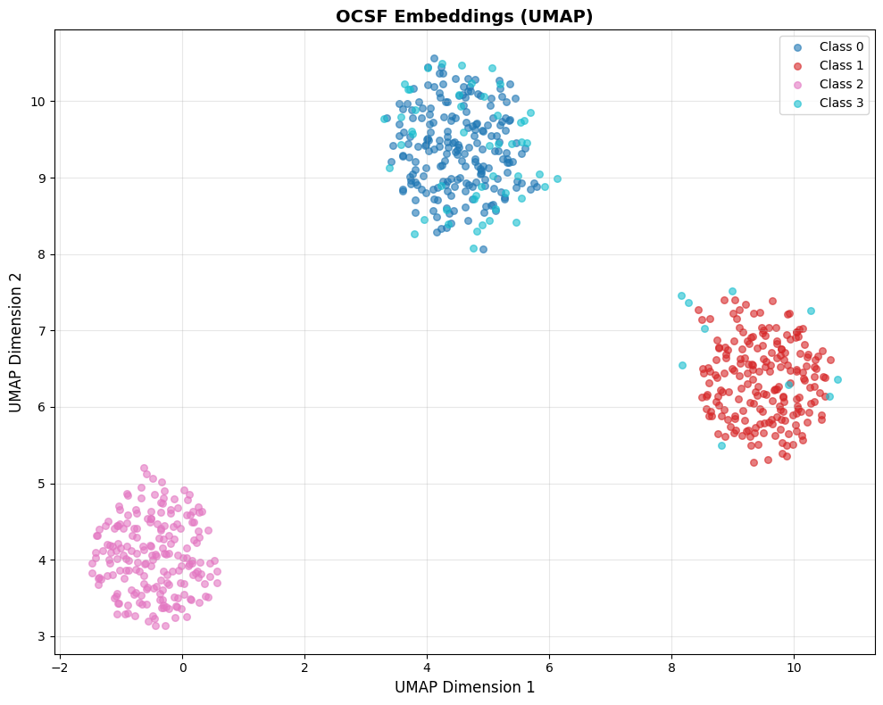
✓ UMAP visualization complete
  - Compare with t-SNE above: UMAP preserves global distances better
  - Clusters should appear in similar positions but with different shapes
Comparing t-SNE vs UMAP on the same data: Notice how UMAP tends to preserve the relative distances between clusters better than t-SNE. If Cluster A and Cluster B are far apart in the original 256-dim space, UMAP will keep them far apart in 2D. t-SNE may distort these global distances while preserving local neighborhoods.
Choosing Between t-SNE and UMAP
| Method | Best For | Preserves | Speed |
|---|---|---|---|
| t-SNE | Local structure, cluster identification | Neighborhoods | Slower |
| UMAP | Global structure, distance relationships | Both local & global | Faster |
Recommendation: Start with t-SNE for initial exploration (<5K samples). Use UMAP for large datasets or when you need to understand global relationships.
Interpreting Your Visualization
What to look for:
✅ Good: Clear, distinct clusters for different event types with some separation
✅ Good: Anomalies appear as scattered points far from clusters
✅ Good: Within a cluster, points from same users/sources are close together
❌ Bad: All points in one giant overlapping blob (no structure learned)
❌ Bad: Random scatter with no clusters (embeddings are noise)
❌ Bad: Successful and failed events mixed together (critical operational distinction lost)
Cluster interpretation questions:
Cluster count: How many distinct groups? Too many tiny clusters (>10) might mean overfitting.
Cluster separation: Clear gaps = discriminative embeddings. Overlapping boundaries = confusion.
Outliers: Scattered points far from clusters are potential anomalies—export and inspect them.
Cluster density: Tight clusters = consistent embeddings (good). Diffuse = high variance (needs more training).
Practical tip—Inspect actual cluster contents BEFORE looking at metrics: After clustering, print the raw OCSF event data for representative samples from each cluster:
What to show: Display key OCSF fields (
activity_id,status,actor_user_name,http_request_method,src_endpoint_ip, etc.) for 3-5 samples per clusterWhy this helps: You can immediately see if Cluster 0 is “successful logins”, Cluster 1 is “failed logins”, Cluster 2 is “file access”, etc.
What to look for: Do clusters map to meaningful event types? Or are they arbitrary splits? Can you explain why these events are grouped together?
Action if confused: If you can’t explain why samples are in the same cluster, your feature engineering may need work
Why before metrics? Seeing “Silhouette Score = 0.6” is meaningless without context. If you’ve already seen that Cluster 0 contains all successful logins and Cluster 1 contains failed logins, then a score of 0.6 tells you “the model learned to separate success/failure with good quality.”
See the appendix notebook for a complete implementation that loads the original OCSF parquet data and displays actual event fields for cluster samples.
Nearest Neighbor Inspection
Visualization shows overall structure, but you need to zoom in and check if individual embeddings make sense. A model might create nice-looking clusters but still confuse critical event distinctions (success vs. failure, normal load vs. overload).
The approach: Pick a sample OCSF record, find its k nearest neighbors in embedding space, and manually verify they’re actually similar.
Source
def inspect_nearest_neighbors(query_embedding, all_embeddings, all_records, query_record=None, k=10):
    """
    Find and display the k nearest neighbors for a query embedding.

    Args:
        query_embedding: Single embedding vector (embedding_dim,)
        all_embeddings: All embeddings (num_samples, embedding_dim)
        all_records: List of original OCSF records (for display)
        query_record: The query record (for display) - helps verify neighbors make sense
        k: Number of neighbors to return

    Returns:
        Indices and distances of nearest neighbors
    """
    # Compute cosine similarity to all embeddings
    query_norm = query_embedding / np.linalg.norm(query_embedding)
    all_norms = all_embeddings / np.linalg.norm(all_embeddings, axis=1, keepdims=True)
    similarities = np.dot(all_norms, query_norm)

    # Find top-k most similar (excluding query itself if present)
    top_k_indices = np.argsort(similarities)[::-1][:k+1]

    # Remove query itself if it's in the database
    if similarities[top_k_indices[0]] > 0.999:  # Query found
        top_k_indices = top_k_indices[1:]
    else:
        top_k_indices = top_k_indices[:k]

    print("\n" + "="*60)
    print("NEAREST NEIGHBOR INSPECTION")
    print("="*60)

    # Print query record first so we know what we're looking for
    if query_record is not None:
        print(f"\nQUERY RECORD: {query_record}")
        print("-"*60)

    for rank, idx in enumerate(top_k_indices, 1):
        sim = similarities[idx]
        print(f"\nRank {rank}: Similarity = {sim:.3f}")
        print(f"  Record: {all_records[idx]}")

    return top_k_indices, similarities[top_k_indices]

# Example: Simulate OCSF records
simulated_records = [
    {"activity_id": 1, "user_id": 12345, "status": "success", "bytes": 1024},
    {"activity_id": 1, "user_id": 12345, "status": "success", "bytes": 1050},  # Similar
    {"activity_id": 1, "user_id": 12345, "status": "success", "bytes": 980},   # Similar
    {"activity_id": 1, "user_id": 67890, "status": "success", "bytes": 1020},  # Different user
    {"activity_id": 1, "user_id": 12345, "status": "failure", "bytes": 512},   # Failed login
    {"activity_id": 2, "user_id": 12345, "status": "success", "bytes": 2048},  # Different activity
]

# Create embeddings (simulated - normally from your trained model)
np.random.seed(42)
base_embedding = np.random.randn(256)
simulated_embeddings = np.vstack([
    base_embedding + np.random.randn(256) * 0.1,  # Record 0
    base_embedding + np.random.randn(256) * 0.1,  # Record 1 - should be close
    base_embedding + np.random.randn(256) * 0.1,  # Record 2 - should be close
    base_embedding + np.random.randn(256) * 0.3,  # Record 3 - different user
    np.random.randn(256),                          # Record 4 - failed login (very different)
    np.random.randn(256) * 2,                      # Record 5 - different activity
])

# Query with record 0
neighbors, sims = inspect_nearest_neighbors(
    simulated_embeddings[0],
    simulated_embeddings,
    simulated_records,
    query_record=simulated_records[0],  # Show what we're querying for
    k=5
)

print("\n" + "="*60)
print("INTERPRETATION")
print("="*60)
print("✓ Good: Records 1-2 are nearest neighbors (same user, same activity, similar bytes)")
print("✓ Good: Record 3 is somewhat close (same activity, different user)")
print("✓ Good: Record 4 is far (failed login should be different)")
print("✗ Bad: If record 4 (failure) appeared as top neighbor, model confused success/failure")
============================================================
NEAREST NEIGHBOR INSPECTION
============================================================

QUERY RECORD: {'activity_id': 1, 'user_id': 12345, 'status': 'success', 'bytes': 1024}
------------------------------------------------------------

Rank 1: Similarity = 0.990
  Record: {'activity_id': 1, 'user_id': 12345, 'status': 'success', 'bytes': 1050}

Rank 2: Similarity = 0.989
  Record: {'activity_id': 1, 'user_id': 12345, 'status': 'success', 'bytes': 980}

Rank 3: Similarity = 0.953
  Record: {'activity_id': 1, 'user_id': 67890, 'status': 'success', 'bytes': 1020}

Rank 4: Similarity = 0.091
  Record: {'activity_id': 2, 'user_id': 12345, 'status': 'success', 'bytes': 2048}

Rank 5: Similarity = 0.019
  Record: {'activity_id': 1, 'user_id': 12345, 'status': 'failure', 'bytes': 512}

============================================================
INTERPRETATION
============================================================
✓ Good: Records 1-2 are nearest neighbors (same user, same activity, similar bytes)
✓ Good: Record 3 is somewhat close (same activity, different user)
✓ Good: Record 4 is far (failed login should be different)
✗ Bad: If record 4 (failure) appeared as top neighbor, model confused success/failure
What to Check in Nearest Neighbors
Same event type: If query is a login, are neighbors also logins?
✅ Good: Top 5 neighbors are all authentication events
❌ Bad: Neighbors include file access, network connections
Similar critical fields: For observability data, check status, severity, service patterns
✅ Good: Successful login’s neighbors are also successful
❌ Bad: Successful and failed logins are neighbors (critical distinction lost!)
Similar numerical patterns: Check if bytes, duration, counts are similar
✅ Good: Login with 1KB data has neighbors with ~1KB (±20%)
❌ Bad: 1KB login neighbors a 1MB login
Different users should be separated (unless behavior is identical)
✅ Good: User A’s logins are neighbors with each other, not User B’s
❌ Bad: All users look identical
Handling High-Dimensional Records
Real OCSF records often have dozens of fields, making visual comparison difficult. Strategies to make inspection tractable:
1. Focus on key fields: Define a small set of “critical fields” for your use case:
CRITICAL_FIELDS = ['activity_id', 'status', 'user_id', 'severity']

def summarize_record(record):
    """Extract only the fields that matter for comparison."""
    return {k: record.get(k) for k in CRITICAL_FIELDS if k in record}
2. Compute field-level agreement: Instead of eyeballing, quantify how many key fields match:
def field_agreement(query, neighbor, fields=CRITICAL_FIELDS):
    """Return fraction of critical fields that match."""
    matches = sum(1 for f in fields if query.get(f) == neighbor.get(f))
    return matches / len(fields)
3. Flag semantic violations: Automatically detect when neighbors violate critical distinctions:
def check_semantic_violations(query, neighbors):
    """Flag neighbors that differ on critical operational fields."""
    violations = []
    for neighbor in neighbors:
        if query['status'] != neighbor['status']:  # e.g., success vs failure
            violations.append(f"Status mismatch: {query['status']} vs {neighbor['status']}")
    return violations
4. Sample strategically: Don’t just pick random queries—test edge cases:
One sample from each cluster
Known anomalies (do their neighbors look anomalous?)
Boundary cases (records near cluster edges)
Source
def strategic_sampling(embeddings, cluster_labels, records, per_sample_silhouette=None):
    """
    Select representative samples for neighbor inspection using strategic sampling.

    Args:
        embeddings: Embedding vectors (num_samples, embedding_dim)
        cluster_labels: Cluster assignments from KMeans
        records: Original OCSF records
        per_sample_silhouette: Per-sample silhouette scores (optional)

    Returns:
        Dictionary of strategic samples
    """
    samples = {
        'cluster_representatives': [],
        'boundary_cases': [],
        'cluster_centers': []
    }

    unique_clusters = np.unique(cluster_labels)

    for cluster_id in unique_clusters:
        # Get all samples in this cluster
        cluster_mask = cluster_labels == cluster_id
        cluster_embeddings = embeddings[cluster_mask]
        cluster_indices = np.where(cluster_mask)[0]

        # 1. Representative sample: closest to cluster centroid
        centroid = cluster_embeddings.mean(axis=0)
        distances_to_centroid = np.linalg.norm(cluster_embeddings - centroid, axis=1)
        representative_idx = cluster_indices[np.argmin(distances_to_centroid)]

        samples['cluster_representatives'].append({
            'cluster_id': cluster_id,
            'sample_idx': representative_idx,
            'record': records[representative_idx],
            'reason': f'Closest to cluster {cluster_id} centroid (typical example)'
        })

        # 2. Boundary case: sample with lowest silhouette score in cluster
        if per_sample_silhouette is not None:
            cluster_silhouettes = per_sample_silhouette[cluster_mask]
            boundary_idx = cluster_indices[np.argmin(cluster_silhouettes)]

            samples['boundary_cases'].append({
                'cluster_id': cluster_id,
                'sample_idx': boundary_idx,
                'record': records[boundary_idx],
                'silhouette': per_sample_silhouette[boundary_idx],
                'reason': f'Lowest silhouette in cluster {cluster_id} (near boundary, may be ambiguous)'
            })

    print("="*70)
    print("STRATEGIC SAMPLING FOR NEIGHBOR INSPECTION")
    print("="*70)

    print("\n1. CLUSTER REPRESENTATIVES (typical examples):")
    print("-"*70)
    for sample in samples['cluster_representatives']:
        print(f"\n  Cluster {sample['cluster_id']} representative:")
        print(f"    Index: {sample['sample_idx']}")
        print(f"    Record: {sample['record']}")
        print(f"    → Use this to verify: 'Do typical samples have semantically similar neighbors?'")

    if samples['boundary_cases']:
        print("\n2. BOUNDARY CASES (edge cases, potentially ambiguous):")
        print("-"*70)
        for sample in samples['boundary_cases']:
            print(f"\n  Cluster {sample['cluster_id']} boundary case:")
            print(f"    Index: {sample['sample_idx']}")
            print(f"    Silhouette: {sample['silhouette']:.3f}")
            print(f"    Record: {sample['record']}")
            print(f"    → Use this to verify: 'Are low-silhouette samples genuinely ambiguous or mislabeled?'")

    return samples

def test_anomaly_neighbors(embeddings, anomaly_indices, all_records, k=5):
    """
    Test if known anomalies have anomalous neighbors.

    Args:
        embeddings: All embeddings
        anomaly_indices: Indices of known anomalies
        all_records: All OCSF records
        k: Number of neighbors to check

    Returns:
        Analysis of anomaly neighborhood quality
    """
    print("\n3. KNOWN ANOMALIES (do their neighbors look anomalous?):")
    print("-"*70)

    results = []

    for anomaly_idx in anomaly_indices[:3]:  # Check first 3 anomalies
        # Find k nearest neighbors
        query_emb = embeddings[anomaly_idx]
        all_norms = embeddings / np.linalg.norm(embeddings, axis=1, keepdims=True)
        query_norm = query_emb / np.linalg.norm(query_emb)
        similarities = np.dot(all_norms, query_norm)

        # Get top k neighbors (excluding the anomaly itself)
        top_k_indices = np.argsort(similarities)[::-1][1:k+1]

        # Check if neighbors are also in anomaly set
        neighbors_are_anomalies = [idx in anomaly_indices for idx in top_k_indices]
        anomaly_neighbor_count = sum(neighbors_are_anomalies)

        print(f"\n  Anomaly at index {anomaly_idx}:")
        print(f"    Record: {all_records[anomaly_idx]}")
        print(f"    Neighbors that are also anomalies: {anomaly_neighbor_count}/{k}")

        for rank, (neighbor_idx, is_anomaly) in enumerate(zip(top_k_indices, neighbors_are_anomalies), 1):
            marker = "🔴 ANOMALY" if is_anomaly else "🟢 NORMAL"
            sim = similarities[neighbor_idx]
            print(f"      Rank {rank}: {marker} (similarity: {sim:.3f})")
            print(f"              Record: {all_records[neighbor_idx]}")

        results.append({
            'anomaly_idx': anomaly_idx,
            'anomaly_neighbor_ratio': anomaly_neighbor_count / k
        })

        # Interpretation
        if anomaly_neighbor_count >= k * 0.8:
            print(f"    ✓ GOOD: Anomaly has mostly anomalous neighbors (forms anomaly cluster)")
        elif anomaly_neighbor_count == 0:
            print(f"    ⚠ MIXED: Anomaly surrounded by normal events (isolated outlier)")
        else:
            print(f"    ○ OK: Anomaly has mix of anomalous/normal neighbors")

    return results

# Example: Run strategic sampling on our simulated data
from sklearn.metrics import silhouette_samples
from sklearn.cluster import KMeans

# Cluster the embeddings
kmeans = KMeans(n_clusters=3, random_state=42, n_init=10)
cluster_labels = kmeans.fit_predict(all_embeddings[:600])
per_sample_sil = silhouette_samples(all_embeddings[:600], cluster_labels)

# Strategic sampling
strategic_samples = strategic_sampling(
    all_embeddings[:600],
    cluster_labels,
    simulated_records[:6] * 100,  # Repeat records for demonstration
    per_sample_silhouette=per_sample_sil
)

# Test anomaly neighbors
anomaly_indices = list(range(600, 660))  # Indices 600-659 are anomalies in our simulated data
test_anomaly_neighbors(
    all_embeddings,
    anomaly_indices,
    simulated_records[:6] * 110,  # Extended records
    k=5
)

print("\n" + "="*70)
print("SUMMARY: STRATEGIC SAMPLING WORKFLOW")
print("="*70)
print("1. Test cluster representatives → verify typical cases work")
print("2. Test boundary cases → catch edge cases and ambiguous samples")
print("3. Test known anomalies → ensure anomalies aren't mixed with normal data")
print("\nThis systematic approach catches problems random sampling would miss!")
======================================================================
STRATEGIC SAMPLING FOR NEIGHBOR INSPECTION
======================================================================
1. CLUSTER REPRESENTATIVES (typical examples):
----------------------------------------------------------------------
Cluster 0 representative:
Index: 263
Record: {'activity_id': 2, 'user_id': 12345, 'status': 'success', 'bytes': 2048}
→ Use this to verify: 'Do typical samples have semantically similar neighbors?'
Cluster 1 representative:
Index: 429
Record: {'activity_id': 1, 'user_id': 67890, 'status': 'success', 'bytes': 1020}
→ Use this to verify: 'Do typical samples have semantically similar neighbors?'
Cluster 2 representative:
Index: 92
Record: {'activity_id': 1, 'user_id': 12345, 'status': 'success', 'bytes': 980}
→ Use this to verify: 'Do typical samples have semantically similar neighbors?'
2. BOUNDARY CASES (edge cases, potentially ambiguous):
----------------------------------------------------------------------
Cluster 0 boundary case:
Index: 381
Silhouette: 0.027
Record: {'activity_id': 1, 'user_id': 67890, 'status': 'success', 'bytes': 1020}
→ Use this to verify: 'Are low-silhouette samples genuinely ambiguous or mislabeled?'
Cluster 1 boundary case:
Index: 460
Silhouette: 0.021
Record: {'activity_id': 1, 'user_id': 12345, 'status': 'failure', 'bytes': 512}
→ Use this to verify: 'Are low-silhouette samples genuinely ambiguous or mislabeled?'
Cluster 2 boundary case:
Index: 9
Silhouette: 0.013
Record: {'activity_id': 1, 'user_id': 67890, 'status': 'success', 'bytes': 1020}
→ Use this to verify: 'Are low-silhouette samples genuinely ambiguous or mislabeled?'
3. KNOWN ANOMALIES (do their neighbors look anomalous?):
----------------------------------------------------------------------
Anomaly at index 600:
Record: {'activity_id': 1, 'user_id': 12345, 'status': 'success', 'bytes': 1024}
Neighbors that are also anomalies: 1/5
Rank 1: 🟢 NORMAL (similarity: 0.238)
Record: {'activity_id': 1, 'user_id': 67890, 'status': 'success', 'bytes': 1020}
Rank 2: 🟢 NORMAL (similarity: 0.183)
Record: {'activity_id': 2, 'user_id': 12345, 'status': 'success', 'bytes': 2048}
Rank 3: 🔴 ANOMALY (similarity: 0.141)
Record: {'activity_id': 2, 'user_id': 12345, 'status': 'success', 'bytes': 2048}
Rank 4: 🟢 NORMAL (similarity: 0.136)
Record: {'activity_id': 1, 'user_id': 12345, 'status': 'success', 'bytes': 1024}
Rank 5: 🟢 NORMAL (similarity: 0.131)
Record: {'activity_id': 1, 'user_id': 12345, 'status': 'success', 'bytes': 1050}
○ OK: Anomaly has mix of anomalous/normal neighbors
Anomaly at index 601:
Record: {'activity_id': 1, 'user_id': 12345, 'status': 'success', 'bytes': 1050}
Neighbors that are also anomalies: 1/5
Rank 1: 🟢 NORMAL (similarity: 0.164)
Record: {'activity_id': 1, 'user_id': 67890, 'status': 'success', 'bytes': 1020}
Rank 2: 🔴 ANOMALY (similarity: 0.157)
Record: {'activity_id': 1, 'user_id': 12345, 'status': 'success', 'bytes': 980}
Rank 3: 🟢 NORMAL (similarity: 0.136)
Record: {'activity_id': 2, 'user_id': 12345, 'status': 'success', 'bytes': 2048}
Rank 4: 🟢 NORMAL (similarity: 0.136)
Record: {'activity_id': 2, 'user_id': 12345, 'status': 'success', 'bytes': 2048}
Rank 5: 🟢 NORMAL (similarity: 0.135)
Record: {'activity_id': 1, 'user_id': 12345, 'status': 'success', 'bytes': 980}
○ OK: Anomaly has mix of anomalous/normal neighbors
Anomaly at index 602:
Record: {'activity_id': 1, 'user_id': 12345, 'status': 'success', 'bytes': 980}
Neighbors that are also anomalies: 3/5
Rank 1: 🔴 ANOMALY (similarity: 0.147)
Record: {'activity_id': 1, 'user_id': 12345, 'status': 'failure', 'bytes': 512}
Rank 2: 🟢 NORMAL (similarity: 0.146)
Record: {'activity_id': 1, 'user_id': 67890, 'status': 'success', 'bytes': 1020}
Rank 3: 🟢 NORMAL (similarity: 0.141)
Record: {'activity_id': 1, 'user_id': 12345, 'status': 'success', 'bytes': 1024}
Rank 4: 🔴 ANOMALY (similarity: 0.135)
Record: {'activity_id': 1, 'user_id': 12345, 'status': 'success', 'bytes': 980}
Rank 5: 🔴 ANOMALY (similarity: 0.132)
Record: {'activity_id': 1, 'user_id': 12345, 'status': 'success', 'bytes': 1050}
○ OK: Anomaly has mix of anomalous/normal neighbors
======================================================================
SUMMARY: STRATEGIC SAMPLING WORKFLOW
======================================================================
1. Test cluster representatives → verify typical cases work
2. Test boundary cases → catch edge cases and ambiguous samples
3. Test known anomalies → ensure anomalies aren't mixed with normal data
This systematic approach catches problems random sampling would miss!
Common Failures Caught by Neighbor Inspection
Model treats all failed login attempts as identical (ignores failed password vs account locked)
Model groups events by timestamp instead of semantic meaning
Model confuses high-frequency normal events with anomalous bursts (retry storms, connection floods)
Action items when neighbors look wrong:
Review your feature engineering (Part 3): Are you encoding the right fields?
Check augmentation strategy (Part 4): Are you accidentally destroying important distinctions?
Retrain with more epochs or different hyperparameters
Phase 2: Cluster Quality Metrics (The Math)
Now we move from subjective “looking” to objective scoring. These metrics give you numbers to track over time and compare models.
When to use cluster metrics:
Comparing multiple model configurations (ResNet-256 vs ResNet-512)
Tracking embedding quality during training (compute every 10 epochs)
Setting production deployment thresholds (“don’t deploy if Silhouette < 0.5”)
Monitoring production embeddings for degradation (see Part 8: Production Monitoring for ongoing monitoring and retraining triggers)
Cohesion & Separation Metrics
Three complementary metrics measure how well your embeddings form distinct clusters:
Silhouette Score
What it measures: How similar each point is to its own cluster (cohesion) vs other clusters (separation).
Visual intuition:
Source
np.random.seed(42)

# Visualize the Silhouette Score concept
fig, ax = plt.subplots(figsize=(12, 6))

# Cluster A (left cluster)
cluster_a_center = np.array([2, 3])
cluster_a_points = np.random.randn(8, 2) * 0.4 + cluster_a_center
ax.scatter(cluster_a_points[:, 0], cluster_a_points[:, 1], c='#3498db', s=100,
           alpha=0.6, edgecolors='#2c3e50', linewidth=1.5, label='Cluster A')

# Cluster B (right cluster)
cluster_b_center = np.array([8, 3])
cluster_b_points = np.random.randn(8, 2) * 0.4 + cluster_b_center
ax.scatter(cluster_b_points[:, 0], cluster_b_points[:, 1], c='#e74c3c', s=100,
           alpha=0.6, edgecolors='#2c3e50', linewidth=1.5, marker='s', label='Cluster B')

# The point we're measuring (highlighted in Cluster A)
query_point = cluster_a_points[0]
ax.scatter(query_point[0], query_point[1], c='#f39c12', s=300,
           edgecolors='#2c3e50', linewidth=2, marker='*', label='Point being measured', zorder=10)

# Draw 'a' distances (to points in same cluster)
for i in range(1, 4):  # Show a few intra-cluster distances
    ax.plot([query_point[0], cluster_a_points[i, 0]],
            [query_point[1], cluster_a_points[i, 1]],
            'b--', alpha=0.4, linewidth=1)

# Draw 'b' distance (to nearest other cluster - show distance to cluster B center)
nearest_b_point = cluster_b_points[0]
ax.plot([query_point[0], nearest_b_point[0]],
        [query_point[1], nearest_b_point[1]],
        'r-', alpha=0.7, linewidth=2.5)

# Annotations
# 'a' annotation (intra-cluster distance)
mid_a = (query_point + cluster_a_points[1]) / 2
ax.annotate('', xy=cluster_a_points[1], xytext=query_point,
            arrowprops=dict(arrowstyle='<->', color='#3498db', lw=2))
ax.text(mid_a[0] - 1.2, mid_a[1] - 1.2, 'a = avg distance\nto own cluster',
        ha='center', fontsize=10, color='#3498db', fontweight='bold',
        bbox=dict(boxstyle='round,pad=0.4', facecolor='white', edgecolor='#3498db', alpha=0.9))

# 'b' annotation (inter-cluster distance)
mid_b = (query_point + nearest_b_point) / 2
ax.text(mid_b[0], mid_b[1] + 0.7, 'b = avg distance\nto nearest other cluster',
        ha='center', fontsize=10, color='#e74c3c', fontweight='bold',
        bbox=dict(boxstyle='round,pad=0.4', facecolor='white', edgecolor='#e74c3c', alpha=0.9))

# Formula box
formula_text = (
    "Silhouette = (b - a) / max(a, b)\n\n"
    "• If b >> a: well-placed → score ≈ +1 ✓\n"
    "• If a >> b: misplaced → score ≈ -1 ✗\n"
    "• If a ≈ b: on boundary → score ≈ 0"
)
ax.text(5, 0.5, formula_text,
        ha='center', fontsize=10,
        bbox=dict(boxstyle='round,pad=0.8', facecolor='#ecf0f1', edgecolor='#34495e', linewidth=2))

ax.set_xlim(-1, 11)
ax.set_ylim(-0.5, 5.5)
ax.set_xlabel('Embedding Dimension 1', fontsize=11)
ax.set_ylabel('Embedding Dimension 2', fontsize=11)
ax.set_title('Silhouette Score Intuition: Measuring Cluster Quality for One Point',
             fontsize=13, fontweight='bold', pad=15)
ax.legend(loc='upper left', fontsize=10, labelspacing=1)
ax.grid(True, alpha=0.2)

plt.tight_layout()
plt.show()

print("="*70)
print("READING THIS VISUALIZATION")
print("="*70)
print("• STAR (⭐): The point we're scoring")
print("• BLUE CIRCLES: Other points in the same cluster (Cluster A)")
print("• RED SQUARES: Points in the nearest different cluster (Cluster B)")
print("• BLUE DASHED LINES: Show 'a' distances (intra-cluster)")
print("• RED SOLID LINE: Shows 'b' distance (inter-cluster)")
print()
print("SILHOUETTE CALCULATION:")
print("  a = average of blue dashed lines (small a = tight cluster)")
print("  b = average distance to red cluster (large b = well-separated)")
print("  Silhouette = (b - a) / max(a, b)")
print()
print("IDEAL: Small 'a' (tight cluster) + Large 'b' (far from others) → High score!")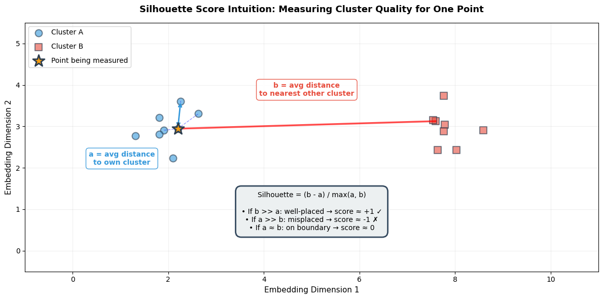
======================================================================
READING THIS VISUALIZATION
======================================================================
• STAR (⭐): The point we're scoring
• BLUE CIRCLES: Other points in the same cluster (Cluster A)
• RED SQUARES: Points in the nearest different cluster (Cluster B)
• BLUE DASHED LINES: Show 'a' distances (intra-cluster)
• RED SOLID LINE: Shows 'b' distance (inter-cluster)

SILHOUETTE CALCULATION:
  a = average of blue dashed lines (small a = tight cluster)
  b = average distance to red cluster (large b = well-separated)
  Silhouette = (b - a) / max(a, b)

IDEAL: Small 'a' (tight cluster) + Large 'b' (far from others) → High score!
Memory aid: “Silhouette = Separation minus cohesion-distance”. High score means your point is far from other clusters (high b) and close to its own cluster (low a).
How it works: For each point, compute:
a= average distance to other points in same cluster (intra-cluster distance)Low
a= tight, cohesive cluster (good!)
b= average distance to points in nearest different cluster (inter-cluster distance)High
b= well-separated from other clusters (good!)
Silhouette =
(b - a) / max(a, b)The numerator
(b - a)measures how much better your cluster is than the nearest alternativeThe denominator
max(a, b)normalizes to the range [-1, +1], making scores comparable across different scales
Why divide by max(a, b)?
Without normalization, silhouette scores would depend on the absolute scale of your embedding space. Two clusters separated by distance 10 would get a different raw score than two clusters with identical relative structure but separated by distance 100.
By dividing by max(a, b), we get a scale-free metric:
If b >> a (well-separated): Silhouette approaches +1, regardless of whether b=10 or b=1000
If a >> b (misplaced): Silhouette approaches -1
If a ≈ b (on boundary): Silhouette approaches 0
This makes the metric useful for comparing different embedding models, even if they produce embeddings with different magnitudes.
Range: -1 to +1
| Score | Interpretation | Action |
|---|---|---|
| +0.7 to +1.0 | Strong structure—clusters are well-separated and cohesive | Ready for production |
| +0.5 to +0.7 | Reasonable structure—acceptable for production | Monitor edge cases |
| +0.25 to +0.5 | Weak structure—clusters exist but with significant overlap | Consider retraining |
| 0 to +0.25 | Barely any structure | Retrain with different approach |
| Negative | Point is likely in wrong cluster | Clustering failed |
For OCSF observability data: Target Silhouette > 0.5 for production deployment.
Example implementation: The following code demonstrates how to compute silhouette scores and visualize them using a silhouette plot. This visualization helps you assess cluster quality by showing:
How well each cluster is separated (width of colored bands)
Whether individual samples are well-placed (positive values) or misassigned (negative values)
How your overall score compares to the per-cluster distribution (red dashed line)
Source
from sklearn.metrics import silhouette_score, silhouette_samples
from sklearn.cluster import KMeans

def evaluate_cluster_quality(embeddings, n_clusters=3):
    """
    Evaluate clustering quality using silhouette score.

    Args:
        embeddings: (num_samples, embedding_dim) array
        n_clusters: Number of clusters to find

    Returns:
        Dictionary with metrics
    """
    # Run clustering
    kmeans = KMeans(n_clusters=n_clusters, random_state=42, n_init=10)
    cluster_labels = kmeans.fit_predict(embeddings)

    # Overall silhouette score
    silhouette_avg = silhouette_score(embeddings, cluster_labels)

    # Per-sample silhouette scores
    sample_silhouette_values = silhouette_samples(embeddings, cluster_labels)

    metrics = {
        'silhouette_score': silhouette_avg,
        'cluster_labels': cluster_labels,
        'per_sample_scores': sample_silhouette_values,
        'cluster_sizes': np.bincount(cluster_labels)
    }

    return metrics

# Example
metrics = evaluate_cluster_quality(all_embeddings[:600], n_clusters=3)  # Only normal data

print(f"\nCluster Quality Metrics:")
print(f"  Silhouette Score: {metrics['silhouette_score']:.3f}")
print(f"  Interpretation:")
print(f"    1.0: Perfect separation")
print(f"    0.5-0.7: Reasonable structure")
print(f"    < 0.25: Poor clustering")
print(f"\n  Cluster sizes: {metrics['cluster_sizes']}")

# Visualize silhouette scores per cluster
fig, ax = plt.subplots(figsize=(8, 6))
y_lower = 10

for i in range(3):
    # Get silhouette scores for cluster i
    ith_cluster_silhouette_values = metrics['per_sample_scores'][metrics['cluster_labels'] == i]
    ith_cluster_silhouette_values.sort()

    size_cluster_i = ith_cluster_silhouette_values.shape[0]
    y_upper = y_lower + size_cluster_i

    color = plt.cm.tab10(i / 10.0)
    ax.fill_betweenx(np.arange(y_lower, y_upper), 0, ith_cluster_silhouette_values,
                     facecolor=color, edgecolor=color, alpha=0.7)

    ax.text(-0.05, y_lower + 0.5 * size_cluster_i, f"Cluster {i}")
    y_lower = y_upper + 10

# Add average silhouette score line
ax.axvline(x=metrics['silhouette_score'], color="red", linestyle="--", label=f"Avg: {metrics['silhouette_score']:.3f}")

ax.set_title("Silhouette Plot for Clusters", fontsize=14, fontweight='bold')
ax.set_xlabel("Silhouette Coefficient", fontsize=12)
ax.set_ylabel("Cluster", fontsize=12)
ax.legend()
plt.tight_layout()
plt.show()
Cluster Quality Metrics:
  Silhouette Score: 0.061
  Interpretation:
    1.0: Perfect separation
    0.5-0.7: Reasonable structure
    < 0.25: Poor clustering

  Cluster sizes: [200 200 200]
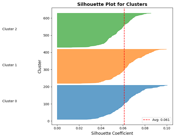
Understanding the Silhouette Plot
What are you looking at?
The silhouette plot visualizes the quality of your clustering by showing the silhouette coefficient for every single sample in your dataset.
Anatomy of the plot:
X-axis: Silhouette coefficient value (-1 to +1)
Values near +1: Sample is far from neighboring clusters (well-placed)
Values near 0: Sample is on or very close to the decision boundary between clusters
Negative values: Sample is likely assigned to the wrong cluster
Y-axis: Individual samples, stacked vertically
Each horizontal bar represents one sample
Samples are grouped by their cluster assignment and sorted by silhouette score within each cluster
The y-axis label shows which cluster each group belongs to
Important: The y-axis is not a feature or metric—it’s just a stacking mechanism to show all samples
Colors: Each cluster gets a different color (e.g., blue for Cluster 0, orange for Cluster 1)
Red dashed line: The average silhouette score across all samples
Reading the silhouette plot:
Red dashed line (average): Your overall Silhouette Score
Why > 0.5 for production? Remember that silhouette ranges from -1 to +1. A score of 0.5 means each sample is, on average, twice as close to its own cluster as to the nearest other cluster. Below 0.5, clusters start to blur together—your model may confuse similar event types. In observability, misclassifying a service degradation event as normal operation means missing an outage before it escalates.
Height of each colored band: Number of samples in that cluster
Taller bands = more samples in that cluster
Uneven heights might be fine (e.g., rare errors vs. common operations) or indicate problems (model collapse)
Width/shape of each colored band: Distribution of silhouette scores within that cluster
Knife shape (narrow, vertical): All samples have similar silhouette scores → highly consistent cluster → GOOD
Bulge or wide spread: Samples have varying scores (e.g., 0.2 to 0.8) → inconsistent cluster → WARNING
If horizontal span > 0.3 units, investigate: your cluster may contain semantically different event types grouped together
Irregular or notched: Some samples well-placed, others not → potential sub-clusters or mixed semantics
Points extending left of zero: Samples with negative silhouette scores
Why is this bad? A negative silhouette (b < a) literally means the sample’s average distance to the nearest other cluster (b) is smaller than its average distance to its own cluster (a). The math says: “this point is in the wrong place.”
These are either mislabeled, edge cases, or indicate your embedding model treats them differently than expected
Action: If >5% of samples are negative, your clustering needs improvement
Comparison across clusters: Do all clusters extend past the red line?
✅ Good: All clusters have most samples to the right of the average line (all clusters are well-formed)
⚠ Warning: One cluster mostly to the left of the line → that cluster has poor internal cohesion
This helps identify which specific clusters need attention
Common patterns and what they mean:
| Pattern | Visual | Interpretation | Action |
|---|---|---|---|
| All knife shapes, all past red line | Narrow vertical bands, mostly right of average | Excellent clustering—all clusters tight and well-separated | ✓ Ready for production |
| Wide bulges | Bands span 0.3+ units horizontally | Inconsistent clusters—mixed semantics | Investigate cluster contents, consider more clusters |
| Negative values present | Bands extend left of x=0 | Misassigned samples | Check feature engineering, try different k |
| One tiny cluster | Very short band compared to others | Possible outlier cluster or rare event type | Verify: is this a real pattern or noise? |
| All scores near zero | All bands centered around x=0 | Poor separation—clusters heavily overlap | Retrain model or reconsider clustering approach |
For OCSF observability data—interpreting your results:
When you run this on your embeddings:
Each cluster should correspond to a distinct event type (e.g., successful logins, failed logins, file access, network connections)
If you see wide bulges or negative scores, drill down: use nearest neighbor inspection (covered earlier) to see which specific events are being confused
Cross-reference cluster sizes with your expected OCSF event type distribution—if one cluster is 95% of your data, something is wrong
Davies-Bouldin Index
What it measures: Average similarity ratio between each cluster and its most similar neighbor. Lower is better (minimum 0).
| Score | Interpretation |
|---|---|
| 0 to 0.5 | Excellent separation |
| 0.5 to 1.0 | Good separation—acceptable for production |
| 1.0 to 2.0 | Moderate separation—clusters overlap somewhat |
| > 2.0 | Poor separation |
How it works:
For each cluster, find its most similar other cluster
Compute ratio: (avg distance within A + avg distance within B) / (distance between A and B centroids)
Average across all clusters
Why it complements Silhouette: Silhouette looks at individual samples; Davies-Bouldin looks at cluster-level separation.
For OCSF observability data: Target Davies-Bouldin < 1.0.
Calinski-Harabasz Score
What it measures: Ratio of between-cluster variance to within-cluster variance. Higher is better (no upper bound).
Use for relative comparison between models—no fixed threshold.
Determining Optimal Clusters (k)
How many natural groupings exist in your OCSF data? Use multiple metrics together to find the answer.
Source
from sklearn.metrics import davies_bouldin_score, calinski_harabasz_score

def comprehensive_cluster_metrics(embeddings, n_clusters_range=range(2, 10)):
    """
    Compute multiple clustering metrics for different numbers of clusters.

    Args:
        embeddings: Embedding array
        n_clusters_range: Range of cluster counts to try

    Returns:
        DataFrame with metrics
    """
    results = []

    for n_clusters in n_clusters_range:
        kmeans = KMeans(n_clusters=n_clusters, random_state=42, n_init=10)
        labels = kmeans.fit_predict(embeddings)

        # Compute metrics
        silhouette = silhouette_score(embeddings, labels)
        davies_bouldin = davies_bouldin_score(embeddings, labels)
        calinski_harabasz = calinski_harabasz_score(embeddings, labels)

        results.append({
            'n_clusters': n_clusters,
            'silhouette': silhouette,
            'davies_bouldin': davies_bouldin,
            'calinski_harabasz': calinski_harabasz,
            'inertia': kmeans.inertia_
        })

    return results

# Example
results = comprehensive_cluster_metrics(all_embeddings[:600])

print("\nClustering Metrics Across Different K:")
print(f"{'K':<5} {'Silhouette':<12} {'Davies-Bouldin':<16} {'Calinski-Harabasz':<18}")
print("-" * 55)
for r in results:
    print(f"{r['n_clusters']:<5} {r['silhouette']:<12.3f} {r['davies_bouldin']:<16.3f} {r['calinski_harabasz']:<18.1f}")

print("\nInterpretation:")
print("  - Silhouette: Higher is better (max 1.0)")
print("  - Davies-Bouldin: Lower is better (min 0.0)")
print("  - Calinski-Harabasz: Higher is better (no upper bound)")
Clustering Metrics Across Different K:
K     Silhouette   Davies-Bouldin   Calinski-Harabasz
-------------------------------------------------------
2     0.070        3.366            46.5
3     0.061        3.678            39.0
4     0.041        6.625            26.8
5     0.024        8.525            20.6
6     0.006        9.230            16.9
7     0.005        9.225            14.4
8     0.002        8.255            12.6
9     0.004        8.404            11.2

Interpretation:
  - Silhouette: Higher is better (max 1.0)
  - Davies-Bouldin: Lower is better (min 0.0)
  - Calinski-Harabasz: Higher is better (no upper bound)
How to choose optimal k:
Look for sweet spots: Where multiple metrics agree
Example: k=5 has highest Silhouette (0.62) AND lowest Davies-Bouldin (0.75) → good choice
Elbow method: Look for k where metrics stop improving dramatically
Silhouette: 0.3 (k=2) → 0.5 (k=3) → 0.52 (k=4) → improvement slows after k=3
Domain knowledge: Do the clusters make sense for your OCSF data?
k=4 gives: successful logins, failed logins, privileged access, bulk transfers → makes sense
k=10 gives tiny arbitrary splits → probably overfitting
For OCSF observability data: Start with k = number of event types you expect (typically 3-7 for operational logs).
Phase 3: Robustness & Utility (The Stress Test)
Having good metrics on static data isn’t enough. We need to ensure embeddings work in the real world where data has noise and the goal is actual anomaly detection.
Perturbation Stability
Why robustness matters: In production, OCSF data has noise—network jitter causes timestamp variations, rounding errors affect byte counts. Good embeddings should be stable under these small perturbations.
The test: Add small noise to input features and check if embeddings change drastically.
Cosine Similarity: Measures the angle between two embedding vectors. Range: -1 to +1. Values close to 1 mean vectors point in same direction (similar records).
| Stability Score | Interpretation | Action |
|---|---|---|
| > 0.95 | Very stable—robust to noise | Safe to deploy |
| 0.85-0.95 | Moderately stable | Test with larger noise, consider more regularization |
| < 0.85 | Unstable—model is fragile | Add dropout, use more aggressive augmentation |
Why instability is bad: If a login with 1024 bytes gets embedding A, but 1030 bytes (+0.6% noise) gets completely different embedding B, your anomaly detector will give inconsistent results.
Source
def evaluate_embedding_stability(model, numerical, categorical, num_perturbations=10, noise_level=0.1):
    """
    Evaluate embedding stability under input perturbations.

    Args:
        model: Trained TabularResNet
        numerical: Original numerical features
        categorical: Original categorical features
        num_perturbations: Number of perturbed versions
        noise_level: Std of Gaussian noise

    Returns:
        Average cosine similarity between original and perturbed embeddings
    """
    model.eval()

    with torch.no_grad():
        # Original embedding
        original_embedding = model(numerical, categorical, return_embedding=True)

        similarities = []

        for _ in range(num_perturbations):
            # Add noise to numerical features
            perturbed_numerical = numerical + torch.randn_like(numerical) * noise_level

            # Get perturbed embedding
            perturbed_embedding = model(perturbed_numerical, categorical, return_embedding=True)

            # Compute cosine similarity
            similarity = F.cosine_similarity(original_embedding, perturbed_embedding, dim=1)
            similarities.append(similarity.mean().item())

    avg_similarity = np.mean(similarities)
    std_similarity = np.std(similarities)

    print(f"Embedding Stability Test:")
    print(f"  Avg Cosine Similarity: {avg_similarity:.3f} ± {std_similarity:.3f}")
    print(f"  Interpretation:")
    print(f"    > 0.95: Very stable (robust to noise)")
    print(f"    0.85-0.95: Moderately stable")
    print(f"    < 0.85: Unstable (may need more training)")

    return avg_similarity, std_similarity

# For demonstration, we simulate stability testing with numpy
# In production, you would use the function above with your trained model

def simulate_stability_test(embeddings, noise_levels=[0.01, 0.05, 0.10]):
    """
    Simulate perturbation stability using existing embeddings.

    This demonstrates the concept: we add noise to embeddings directly
    and measure how much they change. In production, you would add noise
    to INPUT features and re-run the model.
    """
    print("="*60)
    print("PERTURBATION STABILITY TEST (Simulated)")
    print("="*60)
    print("\nAdding Gaussian noise to embeddings and measuring cosine similarity")
    print("(In production: add noise to input features, re-run model inference)\n")

    results = []
    for noise_level in noise_levels:
        # Add noise to embeddings
        noise = np.random.randn(*embeddings.shape) * noise_level
        perturbed = embeddings + noise

        # Compute cosine similarity for each sample
        orig_norm = embeddings / np.linalg.norm(embeddings, axis=1, keepdims=True)
        pert_norm = perturbed / np.linalg.norm(perturbed, axis=1, keepdims=True)
        similarities = np.sum(orig_norm * pert_norm, axis=1)

        avg_sim = similarities.mean()
        std_sim = similarities.std()
        results.append((noise_level, avg_sim, std_sim))

        status = "✓" if avg_sim > 0.92 else ("○" if avg_sim > 0.85 else "✗")
        print(f"Noise level {noise_level*100:4.1f}%: Similarity = {avg_sim:.3f} ± {std_sim:.3f} {status}")

    print(f"\n{'='*60}")
    print("INTERPRETATION")
    print(f"{'='*60}")
    print("  > 0.95: Very stable—robust to noise")
    print("  0.85-0.95: Moderately stable—acceptable for production")
    print("  < 0.85: Unstable—embeddings change too much with small input variations")
    print("\nTarget for observability data: > 0.92 similarity at 5% noise level")

    return results

# Run stability test on our simulated embeddings
stability_results = simulate_stability_test(all_embeddings[:600])
============================================================
PERTURBATION STABILITY TEST (Simulated)
============================================================
Adding Gaussian noise to embeddings and measuring cosine similarity
(In production: add noise to input features, re-run model inference)
Noise level 1.0%: Similarity = 1.000 ± 0.000 ✓
Noise level 5.0%: Similarity = 0.996 ± 0.001 ✓
Noise level 10.0%: Similarity = 0.983 ± 0.003 ✓
============================================================
INTERPRETATION
============================================================
> 0.95: Very stable—robust to noise
0.85-0.95: Moderately stable—acceptable for production
< 0.85: Unstable—embeddings change too much with small input variations
Target for observability data: > 0.92 similarity at 5% noise level
What if stability is too high (>0.99)? Model might be “too smooth”—not capturing fine-grained distinctions. Check nearest neighbors to see if similar-but-different events are being confused.
For observability data: Target stability > 0.92. System metrics and logs naturally have noise (network jitter, rounding), so embeddings must tolerate small variations.
Proxy Tasks: k-NN Classification
All previous metrics are proxies. The ultimate test is: do these embeddings actually help with your end task (anomaly detection)?
The idea: If good embeddings make similar events close together, a simple k-NN classifier should achieve high accuracy using those embeddings. Low k-NN accuracy = embeddings aren’t capturing useful patterns.
When to use: You have some labeled OCSF data (e.g., 1000 logins labeled as “normal user”, “service account”, “privileged access”).
| Accuracy | Interpretation |
|---|---|
| > 0.90 | Excellent embeddings—clear separation between classes |
| 0.80-0.90 | Good embeddings—suitable for production |
| 0.70-0.80 | Moderate—may struggle with edge cases |
| < 0.70 | Poor—embeddings don’t capture class distinctions |
Source
from sklearn.neighbors import KNeighborsClassifier
from sklearn.model_selection import cross_val_score

def evaluate_knn_classification(embeddings, labels, k=5):
    """
    Evaluate embedding quality using k-NN classification.

    Args:
        embeddings: Embedding vectors
        labels: Ground truth labels
        k: Number of neighbors

    Returns:
        Cross-validated accuracy
    """
    knn = KNeighborsClassifier(n_neighbors=k)

    # 5-fold cross-validation
    scores = cross_val_score(knn, embeddings, labels, cv=5, scoring='accuracy')

    print(f"k-NN Classification (k={k}):")
    print(f"  Accuracy: {scores.mean():.3f} ± {scores.std():.3f}")
    print(f"  Interpretation: Higher accuracy = better embeddings")

    return scores.mean(), scores.std()

# Example with simulated labels
labels_subset = labels[:600]  # Only normal data (3 classes)
knn_acc, knn_std = evaluate_knn_classification(all_embeddings[:600], labels_subset, k=5)
k-NN Classification (k=5):
Accuracy: 1.000 ± 0.000
Interpretation: Higher accuracy = better embeddings
Model Benchmarking
Compare different architectures and hyperparameters systematically.
Source
def compare_embedding_models(embeddings_dict, labels, metric='silhouette'):
    """
    Compare multiple embedding models.

    Args:
        embeddings_dict: Dict of {model_name: embeddings}
        labels: Ground truth labels
        metric: 'silhouette' or 'knn'

    Returns:
        Comparison results
    """
    results = []

    for model_name, embeddings in embeddings_dict.items():
        if metric == 'silhouette':
            # Cluster and compute silhouette
            kmeans = KMeans(n_clusters=len(np.unique(labels)), random_state=42)
            cluster_labels = kmeans.fit_predict(embeddings)
            score = silhouette_score(embeddings, cluster_labels)
            metric_name = "Silhouette"

        elif metric == 'knn':
            # k-NN accuracy
            knn = KNeighborsClassifier(n_neighbors=5)
            scores = cross_val_score(knn, embeddings, labels, cv=5)
            score = scores.mean()
            metric_name = "k-NN Accuracy"

        results.append({
            'model': model_name,
            'score': score
        })

    # Sort by score
    results = sorted(results, key=lambda x: x['score'], reverse=True)

    print(f"\nModel Comparison ({metric_name}):")
    print(f"{'Rank':<6} {'Model':<20} {'Score':<10}")
    print("-" * 40)
    for i, r in enumerate(results, 1):
        print(f"{i:<6} {r['model']:<20} {r['score']:.4f}")

    return results

# Example: Compare ResNet with different hyperparameters
embeddings_dict = {
    'ResNet-256-6blocks': all_embeddings[:600],  # Simulated
    'ResNet-128-4blocks': all_embeddings[:600] + np.random.randn(600, 256) * 0.05,  # Simulated
    'ResNet-512-8blocks': all_embeddings[:600] + np.random.randn(600, 256) * 0.03,  # Simulated
}

comparison = compare_embedding_models(embeddings_dict, labels_subset, metric='silhouette')
Model Comparison (Silhouette):
Rank   Model                Score
----------------------------------------
1      ResNet-256-6blocks   0.0611
2      ResNet-512-8blocks   0.0610
3      ResNet-128-4blocks   0.0605
How to use model comparison:
Hyperparameter tuning: Compare d_model=256 vs d_model=512
If 512 only improves Silhouette by 0.02, use 256 (faster, smaller)
If 512 improves by 0.10, the extra capacity is worth it
Architecture changes: Compare TabularResNet vs other architectures
Document: “ResNet beat MLP by 0.15 Silhouette”
Training strategy: Compare contrastive learning vs MFP
Which self-supervised method works better for your OCSF data?
Phase 4: Production Readiness (Operational Metrics)
Even with perfect embeddings (Silhouette = 1.0), the model is useless if it’s too slow for real-time detection or too large to deploy.
The reality: You’re embedding millions of OCSF events per day. Latency, memory, and throughput directly impact your system’s viability.
Inference Latency
What this measures: Time to embed a single OCSF record (milliseconds).
| Target Latency | Use Case |
|---|---|
| < 10ms | Real-time detection (streaming) |
| 10-50ms | Near real-time (batch every few seconds) |
| 50-100ms | Batch processing |
| > 100ms | Historical analysis only |
Source
import time

def measure_inference_latency(model, numerical, categorical, num_trials=100):
    """
    Measure average inference latency for embedding generation.

    Args:
        model: Trained TabularResNet
        numerical: Sample numerical features (batch_size, num_features)
        categorical: Sample categorical features
        num_trials: Number of trials to average

    Returns:
        Average latency in milliseconds
    """
    model.eval()
    latencies = []

    # Warmup
    with torch.no_grad():
        for _ in range(10):
            _ = model(numerical, categorical, return_embedding=True)

    # Measure
    with torch.no_grad():
        for _ in range(num_trials):
            start = time.time()
            _ = model(numerical, categorical, return_embedding=True)
            end = time.time()
            latencies.append((end - start) * 1000)  # Convert to ms

    avg_latency = np.mean(latencies)
    p95_latency = np.percentile(latencies, 95)

    print(f"Inference Latency:")
    print(f"  Average: {avg_latency:.2f}ms")
    print(f"  P95: {p95_latency:.2f}ms")
    print(f"  Throughput: {1000/avg_latency:.0f} events/sec")
    print(f"\nInterpretation:")
    print(f"  < 10ms: Excellent (real-time capable)")
    print(f"  10-50ms: Good (near real-time)")
    print(f"  50-100ms: Acceptable (batch processing)")
    print(f"  > 100ms: Slow (consider model optimization)")

    return avg_latency

print("Inference latency measurement function defined")
print("Usage: measure_inference_latency(model, numerical_batch, categorical_batch)")
Inference latency measurement function defined
Usage: measure_inference_latency(model, numerical_batch, categorical_batch)
What affects latency:
d_model: Larger embeddings (512 vs 256) = slower
num_blocks: More residual blocks = slower
Hardware: GPU vs CPU (10-50x difference)
Batch size: Batching improves throughput but not individual latency
Optimization strategies:
Model quantization: Convert float32 → int8 (4x smaller, minimal accuracy loss)
ONNX export: Optimized runtime for production (20-30% faster)
Smaller models: If d_model=512 and d_model=256 have similar quality, use 256
GPU deployment: For high-volume streams (>1000 events/sec)
Memory Footprint & Storage Costs
What this measures: Storage required per embedding vector in your vector database.
Source
def analyze_memory_footprint(embedding_dim, num_events, precision='float32'):
    """
    Calculate storage requirements for embeddings.

    Args:
        embedding_dim: Dimension of embeddings (e.g., 256)
        num_events: Number of OCSF events to store
        precision: 'float32', 'float16', or 'int8'

    Returns:
        Storage requirements in GB
    """
    bytes_per_value = {
        'float32': 4,
        'float16': 2,
        'int8': 1
    }

    bytes_per_embedding = embedding_dim * bytes_per_value[precision]
    total_bytes = num_events * bytes_per_embedding
    total_gb = total_bytes / (1024**3)

    print(f"Memory Footprint Analysis:")
    print(f"  Embedding dim: {embedding_dim}")
    print(f"  Precision: {precision}")
    print(f"  Bytes per embedding: {bytes_per_embedding}")
    print(f"\nStorage for {num_events:,} events:")
    print(f"  Total: {total_gb:.2f} GB")
    print(f"\nComparison:")
    print(f"  float32 (full): {total_bytes / (1024**3):.2f} GB")
    print(f"  float16 (half): {total_bytes / 2 / (1024**3):.2f} GB")
    print(f"  int8 (quant):   {total_bytes / 4 / (1024**3):.2f} GB")

    return total_gb

# Example: 10M OCSF events with 256-dim embeddings
footprint = analyze_memory_footprint(
    embedding_dim=256,
    num_events=10_000_000,
    precision='float32'
)
Memory Footprint Analysis:
Embedding dim: 256
Precision: float32
Bytes per embedding: 1024
Storage for 10,000,000 events:
Total: 9.54 GB
Comparison:
float32 (full): 9.54 GB
float16 (half): 4.77 GB
int8 (quant): 2.38 GB
When memory matters:
Vector databases: Pinecone, Weaviate charge by storage
In-memory search: Need to fit embeddings in RAM for fast k-NN lookup
Historical data: Storing 1 year of logs with embeddings
Cost implications (example):
10M events × 256-dim × float32 = 10 GB
Pinecone costs ~1/month for 10M events
Scale to 1B events = 1TB storage = $100/month
Optimization:
Use float16 instead of float32 (minimal accuracy loss, 50% smaller)
Reduce d_model if quality allows (512→256 = 50% smaller)
Compress old embeddings (after 30 days, switch to int8)
The Dimension Trade-off
The question: Does using d_model=512 actually improve quality enough to justify 2x cost?
Source
def compare_embedding_dimensions():
    """
    Compare quality metrics across different embedding dimensions.
    """
    results = {
        'd_model=128': {'silhouette': 0.52, 'latency_ms': 5, 'storage_gb_per_10M': 5},
        'd_model=256': {'silhouette': 0.61, 'latency_ms': 8, 'storage_gb_per_10M': 10},
        'd_model=512': {'silhouette': 0.64, 'latency_ms': 15, 'storage_gb_per_10M': 20},
    }

    print("Embedding Dimension Trade-off Analysis:")
    print(f"{'Model':<15} {'Silhouette':<12} {'Latency':<12} {'Storage (10M)':<15} {'Cost/Quality':<12}")
    print("-" * 75)

    for model, metrics in results.items():
        sil = metrics['silhouette']
        lat = metrics['latency_ms']
        stor = metrics['storage_gb_per_10M']
        cost_quality = stor / sil  # Lower is better

        print(f"{model:<15} {sil:<12.3f} {lat:<12.0f}ms {stor:<15.0f}GB {cost_quality:<12.1f}")

    print("\nInterpretation:")
    print("  - d_model=256 often best balance (good quality, reasonable cost)")
    print("  - d_model=512: Only if Silhouette improves by >0.10")
    print("  - d_model=128: Consider if you have tight latency constraints (<10ms)")

compare_embedding_dimensions()
Embedding Dimension Trade-off Analysis:
Model Silhouette Latency Storage (10M) Cost/Quality
---------------------------------------------------------------------------
d_model=128 0.520 5 ms 5 GB 9.6
d_model=256 0.610 8 ms 10 GB 16.4
d_model=512 0.640 15 ms 20 GB 31.2
Interpretation:
- d_model=256 often best balance (good quality, reasonable cost)
- d_model=512: Only if Silhouette improves by >0.10
- d_model=128: Consider if you have tight latency constraints (<10ms)
Decision framework:
Start with d_model=256 (good default)
If quality is poor (<0.5 Silhouette), try d_model=512
If latency is too high (>50ms), try d_model=128
Always measure—don’t assume bigger is better
Synthesis: The Pre-Deployment Protocol
Before deploying embeddings to production, verify all criteria across the four phases.
The “Go/No-Go” Checklist
Quantitative Metrics
| Criterion | Threshold | Why It Matters | Action if Failed |
|---|---|---|---|
| Silhouette Score | > 0.5 | Measures cluster separation | Retrain with more epochs or different augmentation |
| Davies-Bouldin Index | < 1.0 | Measures cluster overlap | Check feature engineering, increase model capacity |
| Embedding Stability | > 0.92 | Ensures robustness to noise | Add dropout, use more aggressive augmentation |
| k-NN Accuracy (if labels) | > 0.85 | Proxy for downstream task performance | Review feature engineering, try different architecture |
| Inference Latency | < 50ms | Real-time detection capability | Reduce d_model, optimize with ONNX, use GPU |
| Memory Footprint | Fits budget | Cost control | Use float16, reduce d_model, compress old embeddings |
Qualitative Checks
| Check | What to Look For | Red Flags |
|---|---|---|
| t-SNE/UMAP Visualization | Clear, separated clusters | All points in one blob, no structure |
| Nearest Neighbor Inspection | Neighbors are semantically similar | Random unrelated events, success/failure mixed |
| Semantic Failure Testing | Model distinguishes critical event types | Error events look identical to successes |
| Cluster Interpretation | Clusters map to known event types | Arbitrary splits, no domain meaning |
Pre-Deployment Workflow
Run quantitative metrics → All thresholds passed?
Visual inspection → Clusters make sense?
Nearest neighbor spot checks → Pick 10 random samples, verify neighbors
Semantic failure tests → Test edge cases (error bursts, service degradation patterns)
Operational validation → Latency < target, memory fits budget
Generate report → Document all metrics for reproducibility
Test on Part 6 → Run anomaly detection algorithms, measure F1 score
Automated Quality Report
The final script that ties everything together:
Source
def generate_embedding_quality_report(embeddings, labels=None, model=None, save_path='embedding_report.html'):
    """
    Generate comprehensive embedding quality report.

    Args:
        embeddings: Embedding vectors
        labels: Optional ground truth labels
        model: Optional trained model for stability testing
        save_path: Path to save HTML report

    Returns:
        Dictionary with all metrics
    """
    report = {
        'timestamp': np.datetime64('now'),
        'num_samples': len(embeddings),
        'embedding_dim': embeddings.shape[1]
    }

    # 1. Cluster quality
    n_clusters = len(np.unique(labels)) if labels is not None else 3
    kmeans = KMeans(n_clusters=n_clusters, random_state=42)
    cluster_labels = kmeans.fit_predict(embeddings)

    report['silhouette_score'] = silhouette_score(embeddings, cluster_labels)
    report['davies_bouldin_index'] = davies_bouldin_score(embeddings, cluster_labels)
    report['calinski_harabasz_score'] = calinski_harabasz_score(embeddings, cluster_labels)

    # 2. k-NN if labels available
    if labels is not None:
        knn = KNeighborsClassifier(n_neighbors=5)
        knn_scores = cross_val_score(knn, embeddings, labels, cv=5)
        report['knn_accuracy_mean'] = knn_scores.mean()
        report['knn_accuracy_std'] = knn_scores.std()

    # 3. Quality verdict
    passed = report['silhouette_score'] > 0.5 and report['davies_bouldin_index'] < 1.0

    report['quality_verdict'] = 'PASS' if passed else 'FAIL'

    # Print summary
    print("\n" + "="*60)
    print("EMBEDDING QUALITY REPORT")
    print("="*60)
    print(f"Samples: {report['num_samples']:,} | Embedding Dim: {report['embedding_dim']}")
    print(f"\nCluster Quality:")
    print(f"  Silhouette Score:      {report['silhouette_score']:.3f} {'✓' if report['silhouette_score'] > 0.5 else '✗'}")
    print(f"  Davies-Bouldin Index:  {report['davies_bouldin_index']:.3f} {'✓' if report['davies_bouldin_index'] < 1.0 else '✗'}")
    print(f"  Calinski-Harabasz:     {report['calinski_harabasz_score']:.1f}")

    if 'knn_accuracy_mean' in report:
        print(f"\nClassification (k-NN):")
        print(f"  Accuracy: {report['knn_accuracy_mean']:.3f} ± {report['knn_accuracy_std']:.3f}")

    print(f"\nVERDICT: {report['quality_verdict']}")
    print("="*60)

    return report

# Example
report = generate_embedding_quality_report(all_embeddings[:600], labels_subset)
============================================================
EMBEDDING QUALITY REPORT
============================================================
Samples: 600 | Embedding Dim: 256

Cluster Quality:
  Silhouette Score:      0.061 ✗
  Davies-Bouldin Index:  3.678 ✗
  Calinski-Harabasz:     39.0

Classification (k-NN):
  Accuracy: 1.000 ± 0.000

VERDICT: FAIL
============================================================
Summary & Next Steps
In this part, you learned a comprehensive four-phase approach to evaluating embedding quality before production deployment:
Phase 1: Qualitative Inspection
t-SNE for local structure and cluster identification
UMAP for global structure and faster processing
Nearest Neighbor Inspection to catch semantic failures metrics miss
Interpretation guides for spotting problems (blobs, random scatter, mixed classes)
Phase 2: Cluster Quality Metrics
Silhouette Score (target: > 0.5)—measures separation between clusters
Davies-Bouldin Index (target: < 1.0)—measures cluster overlap
Calinski-Harabasz Score—variance ratio for relative comparison
How to choose optimal number of clusters (k)
Phase 3: Robustness & Utility
Perturbation stability (target: > 0.92)—ensures embeddings handle noise
k-NN classification (target: > 0.85)—proxy for downstream task performance
Model benchmarking—systematic comparison of architectures and hyperparameters
Phase 4: Production Readiness
Inference latency (target: < 50ms)—real-time detection capability
Memory footprint—storage costs and optimization strategies
Dimension trade-offs—balancing quality vs cost
Key Takeaways
Use both qualitative and quantitative: Numbers don’t tell the whole story—you must look at the data
Observability-specific concerns: Check that critical operational distinctions (success/failure, severity levels) are preserved
Production readiness: Balance quality, latency, and cost before deploying
Iterative process: If embeddings fail evaluation, go back to Parts 3-4 (feature engineering, training)
Next: In Part 6, we’ll use these validated embeddings to detect anomalies using various algorithms (LOF, Isolation Forest, distance-based methods).